
⚡️ Simple but powerful drag-and-drop for React and vanilla JS ⚡️
Snapdrag is a library for drag-and-drop with React in the first place. I was tired of the bulky APIs other libraries offer, so decided to experiment a bit on the ergonomics and simplicity, while maintaining flexibility and customization. It's built on top of snapdrag/core, the universal building block for any framework and vanilla JS.
- Dead simple - just
useDraggable,useDroppablehooks, andOverlaycomponent to go - Super ergonomic - no need for memoizing callbacks or config
- Full customization - rich event system
- Two-way data exchange between draggable and droppable
- Multiple drop targets at the same point - do your logic for multilayer interactions
- No HTML5 drag-and-drop used - for good and for bad
- Installation
- Show me the code!
- How it works
useDraggableuseDroppable- Examples
useDraggableconfigurationuseDroppableconfiguration
npm i --save snapdrag
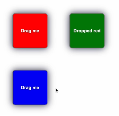
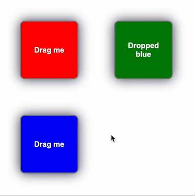
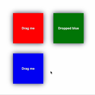
yarn add snapdragHere's the simplest example of two squares. The draggable square carries color in its data, the droppable square reacts to the drag interaction and sets its color according to the color. When dropped, the text of the droppable square is updated.
The DraggableSquare uses useDraggable hook to make it draggable. The config of the hook defines the kind and the data of the draggable. The draggable wrapper is used to make the component actually draggable:
import { useDraggable } from "snapdrag";

export const DraggableSquare = ({ color }: { color: string }) => {
  const { draggable, isDragging } = useDraggable({
    kind: "SQUARE",
    data: { color },
    move: true,
  });

  const opacity = isDragging ? 0.5 : 1;

  return draggable(
    <div className="square" style={{ backgroundColor: color, opacity }}>
      {isDragging ? "Dragging" : "Drag me"}
    </div>
  );
};
The DroppableSquare uses useDroppable hook to make it droppable. The config defines the accepted kind and the callback for the drop event. The droppable wrapper is used to make the component droppable. hovered is used to get the data of draggable when it's hovered:
import { useDroppable } from "snapdrag";

export const DroppableSquare = ({ color }: { color: string }) => {
  const [text, setText] = React.useState("Drop here");

  const { droppable, hovered } = useDroppable({
    accepts: "SQUARE",
    onDrop({ data }) {
      setText(`Dropped ${data.color}`);
    },
  });

  const backgroundColor = hovered ? hovered.data.color : color;

  return droppable(
    <div className="square" style={{ backgroundColor }}>
      {text}
    </div>
  );
};
The App component renders the draggable and droppable squares. The draggable square is wrapped in an absolute wrapper to position it on the page. The Overlay component is rendered to show the dragged component:
import { Overlay } from "snapdrag";

export default function App() {
  return (
    <>
      {/* Render squares with absolute wrappers for positioning */}
      <div style={{ position: "relative" }}>
        <div style={{ position: "absolute", top: 100, left: 100 }}>
          <DraggableSquare color="red" />
        </div>
        <div style={{ position: "absolute", top: 100, left: 300 }}>
          <DroppableSquare color="green" />
        </div>
      </div>
      {/* Render overlay to show the dragged component */}
      <Overlay />
    </>
  );
}
This example on CodeSandbox: https://codesandbox.io/p/sandbox/snapdrag-simple-squares-8rw96s
See more examples in the examples folder and in the Examples section.
Under the hood, Snapdrag attaches pointerdown event listener to draggable elements, and after it's triggered, it tracks pointermove on the document until pointerup happens. On every pointermove event it checks elements under the cursor using document.elementsFromPoint(), and then does the logic of tracking current and new droppables at the point.
Draggables aren't bound to config, so it can be changed any time (see core documentation), it makes it very flexible to use new closures, settings, etc. React bindings wraps this logic from core and adapts some arguments to be more convinient.
One important point for React is draggable/drappable wrappers - they keep the original ref to the React element and populate is as usual, so it makes it fully transparent and easy to compose.
useDraggable hook returns an object with draggable and isDragging properties. To make it work, just wrap your component with draggable, and then use isDragging to get the drag status. The only required field in the hook config is kind - it defines how to differentiate the draggable from others:
const DraggableSquare = () => {
  const { draggable, isDragging } = useDraggable({
    kind: "SQUARE",
    // other fields are optional
  });

  return draggable(<div>{isDragging ? "dragging" : "drag me"}</div>);
};
Important note: the wrapped component must take a ref to the DOM node to be draggable. If you specify another ref for the component explicitly, draggable will handle it correctly, like this:
const ref = useRef(null); // ref for your own logic

const { draggable, isDragging } = useDraggable({
  kind: "SQUARE",
});

// the ref will be populated as usual
return draggable(<div ref={ref} />);
Moreover, the return result of the draggable wrapper is just the same component (but with ref to internals). As usual, it can be wrapped in another wrapper, say, droppable. This allows your component to be draggable and droppable at the same time:
const { draggable, isDragging } = useDraggable({
  kind: "SQUARE",
});

const { droppable, hovered } = useDroppable({
  accepts: "SQUARE",
});

const text = isDragging ? "Dragging" : hovered ? "Hovered" : "Drag me";

// the order doesn't matter
return draggable(droppable(<div className="square">{text}</div>));
Draggable configuration has callbacks for different events in the lifecycle of the drag interaction.
There are three of them: onDragStart, onDragMove, and onDragEnd.
The callback is called when drag interaction starts - this means user clicked and started to move the element. In more details, it's called after the shouldDrag returns true. Here's how it looks like in the code:
const Square = () => {
  const { draggable } = useDraggable({
    kind: 'SQUARE',
    data: { color: 'red' },
    onDragStart(props) {
      console.log('drag started');
    }
  });
}
props here contain data related to the interaction: data, event, dragStartEvent, and element. It quite intuitive - data is the data field in config (or the result of data factory function if specified), event is PointerEvent from pointermove handler, and the dragStartEvent.
The dragStartEvent is a bit different - it's PointerEvent from pointerdown event, so it can be used to calculate some relative positions from the current event. The element is HTMLElement, no more.
This callback is also described later in the configuration documentation.
This callback is executed on every pointermove event. As you understand, it's quite time-sensitive, so try to avoid putting expensive logic here.
An example:
const Square = () => {
  const { draggable } = useDraggable({
    kind: 'SQUARE',
    data: { color: 'red' },
    onDragMove(props) {
      console.log('drag move');
    }
  });
}
Props contain all the same data as in the onDragStart callback, but with some additions:
dropTargetsis an array that contain data about current drop targets under the cursor. It's an array, so if the current draggable is over multiple of them, they will be here. Each drop target is represented as an object withdataandelementfields. Thedataisdatafield fromuseDroppableconfig - it makes it possible to pass data between draggable and droppable in both ways. Theelementis droppable element, no surprise here.topandleftand screen coordinates of the draggable
To get more of the idea of dropTargets and using their data, see the Data transfer from droppable to draggable example.
Lets modify the draggable squares example to show how the data can be transfered from droppable to draggable in onDragMove callback.
First, we will change the DraggableSquare.tsx to be the following:
DraggableSquare.tsx
import { useState } from "react";
import { useDraggable } from "snapdrag";

export const DraggableSquare = ({ color: initialColor }: { color: string }) => {
  const [color, setColor] = useState(initialColor);

  const { draggable, isDragging } = useDraggable({
    kind: "SQUARE",
    data: { color },
    move: true,
    onDragMove({ dropTargets }) {
      const color = dropTargets.length
        ? dropTargets[0].data.color
        : initialColor;

      setColor(color);
    },
    onDragEnd(args) {
      setColor(initialColor);
    },
  });

  const opacity = isDragging ? 0.9 : 1;

  return draggable(
    <div className="square" style={{ backgroundColor: color, opacity }}>
      {isDragging ? "Dragging" : "Drag me"}
    </div>
  );
};
Here we have onDragMove and onDragEnd callbacks that control the color of the draggable square. When there is a drop target over the cursor (so dropTargets.length > 0), we get the color from the first drop target's data field.
The DroppableSquare.tsx is mostly the same, but we add the data there and remove color matching logic for convenience:
DroppableSquare.tsx
import React from "react";
import { useDroppable } from "snapdrag";

export const DroppableSquare = ({ color }: { color: string }) => {
  const [text, setText] = React.useState("Drop here");

  const { droppable } = useDroppable({
    accepts: "SQUARE",
    data: { color },
    onDrop({ data }) {
      setText(`Dropped ${data.color}`);
    },
  });

  return droppable(
    <div className="square" style={{ backgroundColor: color }}>
      {text}
    </div>
  );
};
The result looks like this
CodeSandbox link: https://codesandbox.io/p/sandbox/snapdrag-squares-draggable-color-q4v3x7
onDragEnd is triggered on drag interaction end - most commonly, on pointerup event (but it can be changed using mouse config).
There are two outcomes for the end - draggable was dropped on drop target(s) or not. Depending on this, dropTargets argument will be populated accordingly, like in the onDragMove handler.
More about the props the of the hander you can read in the config description.
Like useDraggable, useDroppable takes a config and returns an object with two fields: draggable and hovered. To make your component react to drop interactions, wrap it with droppable. To define what draggable it should accept, define the required accepts field. It can be a string or symbol, an array of them, or a function (see docs below):
export const DroppableSquare = ({ color }: { color: string }) => {
  const { droppable, hovered } = useDroppable({
    accepts: "SQUARE",
    // other config fields are optional
  });

  const backgroundColor = hovered ? hovered.data.color : color;

  return droppable(
    <div className="square" style={{ backgroundColor }}></div>
  );
};
When the droppable is hovered by the draggable, the hovered returns its data and kind. Elsewhere, it's null.
Like the draggable wrapper, the component can be wrapped both in draggable and droppable, the order doesn't matter.
The config of useDroppable can have the following callbacks: onDragIn, onDragOut, onDragMove, and onDrop.
Lets take a look into each of them.
This callback is called when a draggable enters the area of the drop target. It's executed once, and can be used for different interactions like changing color, setting some state, etc.
Here's an example:
import { useState } from 'react';
import { useDroppable } from 'snapdrag';

const DroppableSquare = () => {
  const [text, setText] = useState('drag on me!');

  const { droppable } = useDroppable({
    accepts: 'SQUARE',
    onDragIn(props) {
      setText(`dragged in ${props.data.color}`);
    },
    onDragOut(props) {
      setText(`dragged out ${props.data.color}`);
    },
  });
}
Here we add onDragIn and onDragOut handlers to set text when a draggable square enters and leaves the droppable araa.
onDragMove is called on every pointermove event over the drop target. It can be used for customization of drop target look during drag interaction.
Lets modify the squares example to do the following - render a border on DroppableSquare depending on the position of draggable.
The DroppableSquare will be the same, the only changes will be in the DroppableSquare component.
Here it is:
DroppableSquare.tsx
import { useState } from "react";
import { useDroppable } from "snapdrag";

export const DroppableSquare = ({ color }: { color: string }) => {
  const [text, setText] = useState("Drop here");
  const [borderPosition, setBorderPosition] = useState("");

  const { droppable } = useDroppable({
    accepts: "SQUARE",
    onDragMove({ event, dropElement }) {
      const { top, left, height } = dropElement.getBoundingClientRect();
      const x = event.clientX - left;
      const y = event.clientY - top;

      if (x / y < 1.0) {
        if (x / (height - y) < 1.0) {
          setBorderPosition("borderLeft");
        } else {
          setBorderPosition("borderBottom");
        }
      } else {
        if (x / (height - y) < 1.0) {
          setBorderPosition("borderTop");
        } else {
          setBorderPosition("borderRight");
        }
      }
    },
    onDragOut() {
      setBorderPosition("");
    },
    onDrop({ data }) {
      setText(`Dropped ${data.color}`);
      setBorderPosition("");
    },
  });

  const style = {
    backgroundColor: color,
    [borderPosition]: "10px solid red",
  };

  return droppable(
    <div className="square" style={style}>
      {text}
    </div>
  );
};
Here we add borderPosition state, and in onDragMove handler we calculate a quadrant of the droppable square where we will be showing the border. On onDragOut and onDrop events we remove the border.
The result looks like this:
CodeSandbox link: https://codesandbox.io/p/sandbox/snapdrag-squares-dynamic-border-rcwn7m
This callback is called when draggable is left the drop target area. It's often used in complimentary with onDragStart to do something opposite, like restoring inital state, color, text.
You can see its usage in the previous example with dynamic borders - it's used there to remove borders after cursor leaves the draggable square.
Arguments are mostly the same as in the previous callbacks, more details is the config docs.
This is the most used callback - it defines the reaction of drop target to the end of drop operation. Arguments are the same like in other callbacks, nothing new here.
All the examples contain some usage of this callback, just see it :)
Here's some examples starting from the simplest to the most advanced
How it looks like
This example was shown before in the Show me the code! section. It demonstrates the basic principles of drag-and-drop: onDraggable and onDroppable hooks, kind and acceps values, data transfer, and onDrop handler.
CodeSandbox link: https://codesandbox.io/p/sandbox/snapdrag-simple-squares-8rw96s
How it looks like
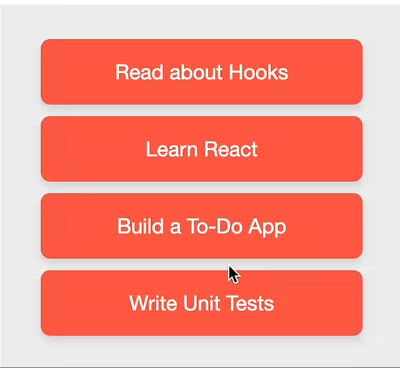
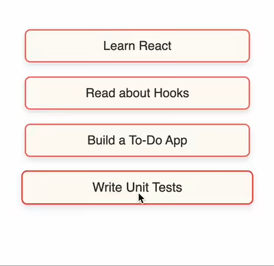
This example shows simple drag-and-drop list with items reordering. There is no animations, the place where the item should be inserted is highlighted with blue line. The used handlers are the same as in the squares example - onDrop, data, and the hooks.
CodeSandbox link: https://codesandbox.io/p/sandbox/snapdrag-simple-list-w4njk5
How it looks like
The advanced list example is, well, a bit more advanced version of the draggable list. It introduces smooth animations and bottom drop area for appending item as the last. The animations are done using CSS transitions - on hover the animated placeholder appears on top of the item, and it created an empty space for drop. After the drop, the placeholder immediately collapses, so the dropped item is integrated into its place without visible artefacts.
CodeSandbox link: https://codesandbox.io/p/sandbox/snapdrag-advanced-list-5p44wd
How it looks like
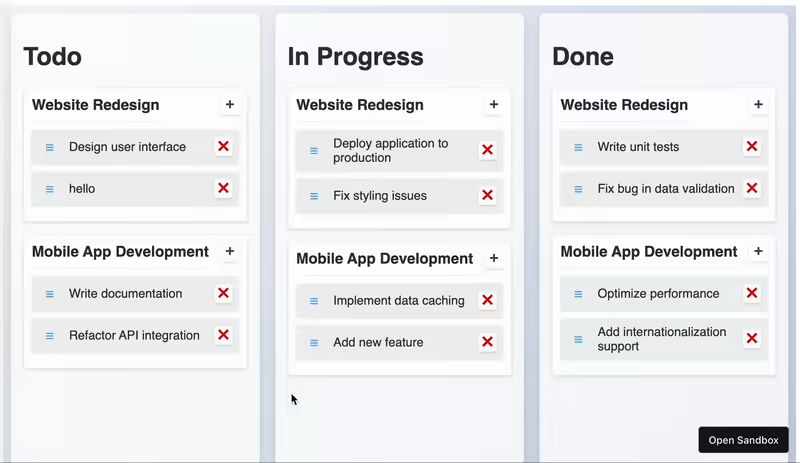
The most advanced example that demostrate what can be achieved with Snapdrag :) There is a lot - multiple drop targets, data exchange, dynamic accepts, smooth animations, item addition and removal, separate projects, touch support, drag threshold, you count it. Might sound a bit overcomplicated, but all the drag logic and layout is done in 200 lines (excluding state managing, initial data, and styled components). Just check it out and see how simple it might be!
CodeSandbox link: https://codesandbox.io/p/sandbox/snapdrag-kanban-board-jlj4wc
The useDraggable hook takes a configuration object that allows you to customize its behavior. Below are the configuration options available:
| Option | Type | Description |
|---|---|---|
kind |
string or symbol |
Required |
data |
object or function |
Data associated with the draggable. It can also be a function returning the data object. |
disabled |
boolean |
Disables the drag functionality when set to true. |
move |
boolean |
Moves the component instead of cloning it to the overlay layer. |
component |
function |
Function that returns a component to be shown as the draggable. |
placeholder |
function |
Function that returns a placeholder component to be shown in place of the draggable component. |
offset |
{ top: number, left: number } or function |
Determines the offset of the dragging component relative to the cursor position. |
Callbacks:
| Callback | Description |
|---|---|
shouldDrag |
Function to define if the element should react to drag interactions. Must return true or false. |
onDragStart |
Called when the drag interaction starts. |
onDragMove |
Called on every mouse move during the drag interaction. |
onDragEnd |
Called when the drag interaction ends. |
Defines the type of the draggable item. It must be a unique string or symbol.
const { draggable, isDragging } = useDraggable({
  kind: "SQUARE",
});Data associated with the draggable item. It can be a static object or a function returning the data object.
const { draggable } = useDraggable({
  kind: "SQUARE",
  data: { color: "red" }, // Static object
});

const { draggable } = useDraggable({
  kind: "SQUARE",
  data: ({ dragElement, dragStartEvent }) => ({ color: "red" }), // Function
});
dragElement is the HTMLElement being dragged, and dragStartEvent is the PointerEvent that started the drag interaction (from pointerdown handler).
Disables the drag functionality when set to true.
const { draggable } = useDraggable({
  kind: "SQUARE",
  disabled: true,
});Moves the component instead of cloning it to the overlay layer.
const { draggable } = useDraggable({
  kind: "SQUARE",
  move: true,
});
If move is false or not defined, the draggable component is cloned to the overlay layer, and the original component is shown as is.
Also, it's important to note that the original component will not receive props updates during the drag interaction - they all are applied to the dragging component.
move is ignored when the placeholder option is specified.
A function that returns a component to be shown as the draggable.
const { draggable } = useDraggable({
  kind: "SQUARE",
  component: ({ data, props }) => <Square color="blue" />,
});
if specified, it will replace the dragging component with the one returned by the function.
data here is the data associated with the draggable. props are the props of the draggable component.
The component function is called on every props update, so you can use it to update the draggable component based on it.
A function that returns a placeholder component to be shown in place of the draggable component. When specified, the move option is ignored.
const { draggable } = useDraggable({
  kind: "SQUARE",
  placeholder: ({ data, props }) => <Square color="gray" />,
});
If specified, the placeholder component is shown in place of the draggable component when it's being dragged.
It's also called on every props update, so you can use it to update the placeholder component based on it.
Determines the offset of the dragging component relative to the cursor position. It can be a static object or a function.
const { draggable } = useDraggable({
  kind: "SQUARE",
  offset: { top: 0, left: 0 }, // Static object
});

const { draggable } = useDraggable({
  kind: "SQUARE",
  offset: ({ element, event, data }) => {
    return { top: 0, left: 0 }; // Function
  },
});TODO: add example demonstrating the offset
Offset is calculated once when the drag interaction starts. It's the distance between the cursor position and the top-left corner of the dragging component. If not specified, it's computed in a way that the component position matches the rendered position before the drag.
Function to define if the element should react to drag interactions. Must return true or false.
const { draggable } = useDraggable({
  kind: "SQUARE",
  shouldDrag: ({ event, dragStartEvent, element, data }) => {
    return true;
  },
});
shouldDrag is called on every mouse move during the drag interaction until it returns true or the drag interaction ends. It's useful to add a threshold or some other condition to start the drag interaction.
The arguments are:
eventis thePointerEventfrom thepointermovehandler.dragStartEventis thePointerEventfrom thepointerdownhandler.elementis the element on which the drag interaction occurs.datais the data associated with the draggable.
Called when the drag interaction starts.
const { draggable } = useDraggable({
  kind: "SQUARE",
  onDragStart: ({ event, dragStartEvent, element, data }) => {
    console.log("Drag started", data);
  },
});
The callback is an important place to do some initial setup or calculations before the drag interaction starts.
The arguments of the callback are:
eventis thePointerEventfrom thepointermovehandler.dragStartEventis thePointerEventfrom thepointerdownhandler.elementis the element on which the drag interaction occurs.datais the data associated with the draggable.
event here is different from dragStartEvent because the onDragStart called only when shouldDrag returns true, so the event is the first pointermove event after that.
Called on every mouse move during the drag interaction. Avoid putting expensive logic here.
const { draggable } = useDraggable({
  kind: "SQUARE",
  onDragMove: ({ event, dragStartEvent, element, data, dropTargets, top, left }) => {
    console.log("Dragging", data);
  },
});
The callback is called on every mouse move during the drag interaction. It's not recommended to put expensive logic here because it's called frequently.
The arguments are the same as in onDragStart with some additions:
dropTargetsis an array of drop targets where the draggable is currently over. The drop target is an object with the following fields:elementis the drop target element.datais the data associated with the drop target.
topandleftare the coordinates of the rendered draggable element relative to the viewport (not mouse coordinates).
Called when the drag interaction ends. dropTargets will be an empty array if the draggable wasn't dropped.
const { draggable } = useDraggable({
  kind: "SQUARE",
  onDragEnd: ({ event, dragStartEvent, element, data, dropTargets }) => {
    console.log("Drag ended", data);
  },
});Here’s a complete example demonstrating the use of all the configuration options:
import { useDraggable } from "snapdrag";

const DraggableSquare = () => {
  const { draggable, isDragging } = useDraggable({
    kind: "SQUARE",
    data: { color: "red" },
    shouldDrag: ({ event, dragStartEvent, element, data }) => true,
    disabled: false,
    move: true,
    component: ({ data }) => <Square color="blue" />,
    placeholder: ({ data }) => <Square color="gray" />,
    offset: { top: 0, left: 0 },
    onDragStart: ({ event, dragStartEvent, element, data }) => {
      console.log("Drag started", data);
    },
    onDragMove: ({ event, dragStartEvent, element, data, dropTargets, top, left }) => {
      console.log("Dragging", data);
    },
    onDragEnd: ({ event, dragStartEvent, element, data, dropTargets }) => {
      console.log("Drag ended", data);
    },
  });

  const opacity = isDragging ? 0.5 : 1;

  return draggable(
    <div className="square" style={{ backgroundColor: "red", opacity }}>
      {isDragging ? "Dragging" : "Drag me"}
    </div>
  );
};Here's a brief description of the configuration fields:
| Option | Type | Description |
|---|---|---|
accepts |
string, symbol, array, or function |
Required. Defines the kinds of draggable items this droppable area can accept. |
data |
object |
Data associated with the droppable area. |
disabled |
boolean |
Disables the drop functionality when set to true. |
Callbacks:
| Callback | Description |
|---|---|
onDragIn |
Called when a draggable item of an accepted kind enters the droppable area. |
onDragOut |
Called when a draggable item leaves the droppable area. |
onDragMove |
Called when a draggable item moves within the droppable area. |
onDrop |
Called when a draggable item is dropped within the droppable area. |
Defines the kinds of draggable items this droppable area can accept. It can be a single kind, an array of kinds, or a function.
const { droppable } = useDroppable({
  accepts: "SQUARE",
});
// or
const { droppable } = useDroppable({
  accepts: ["SQUARE", "CIRCLE"],
});
// or
const { droppable } = useDroppable({
  accepts: ({ kind, data }) => kind === "SQUARE" && data.color === "red",
});
kind is the kind of the draggable item, and data is the data associated with the draggable item.
Data associated with the droppable area.
const { droppable } = useDroppable({
  accepts: "SQUARE",
  data: { maxCapacity: 5 },
});
The data can be accessed from the hovered object when a draggable item is hovered over the droppable area, or dropTargets in the onDragIn, onDragOut, onDragMove, and onDrop callbacks.
Disables the drop functionality when set to true.
const { droppable } = useDroppable({
  accepts: "SQUARE",
  disabled: true,
});Called when a draggable item of an accepted kind enters the droppable area. It's not called if the drop target is disabled, or the draggable item is not accepted.
const { droppable } = useDroppable({
  accepts: "SQUARE",
  onDragIn: ({ kind, data, event, element, dropElement, dropTargets }) => {
    console.log(`Draggable ${kind} entered with data`, data);
  },
});
The arguments are:
kindis the kind of draggable item.datais the data associated with the draggable item.eventis thePointerEventfrom thepointermovehandler.elementis the element being dragged.dropElementis the droppable element itself.dropTargetsis an array of current drop targets. It can be used if there are multiple drop targets at the same point.
Called when a draggable item leaves the droppable area.
const { droppable } = useDroppable({
  accepts: "SQUARE",
  onDragOut: ({ kind, data, event, element, dropElement, dropTargets }) => {
    console.log(`Draggable ${kind} left with data`, data);
  },
});
The arguments are the same as in onDragIn.
Called when a draggable item moves within the droppable area. It's called on every mouse move during the drag interaction, so avoid putting expensive logic here.
const { droppable } = useDroppable({
  accepts: "SQUARE",
  onDragMove: ({ kind, data, event, element, dropElement, dropTargets }) => {
    console.log(`Draggable ${kind} moved with data`, data);
  },
});
The arguments are the same as in onDragIn.
Called when a draggable item is dropped within the droppable area.
const { droppable } = useDroppable({
  accepts: "SQUARE",
  onDrop: ({ kind, data, event, element, dropElement, dropTargets }) => {
    console.log(`Draggable ${kind} dropped with data`, data);
  },
});
The arguments are the same as in onDragIn.
Here’s a complete example demonstrating the use of all the configuration options:
import { useDroppable } from "snapdrag";

const DroppableSquare = () => {
  const { droppable, hovered } = useDroppable({
    accepts: "SQUARE",
    data: { maxCapacity: 5 },
    disabled: false,
    onDragIn: ({ kind, data, event, element, dropElement, dropTargets }) => {
      console.log(`Draggable ${kind} entered with data`, data);
    },
    onDragOut: ({ kind, data, event, element, dropElement, dropTargets }) => {
      console.log(`Draggable ${kind} left with data`, data);
    },
    onDragMove: ({ kind, data, event, element, dropElement, dropTargets }) => {
      console.log(`Draggable ${kind} moved with data`, data);
    },
    onDrop: ({ kind, data, event, element, dropElement, dropTargets }) => {
      console.log(`Draggable ${kind} dropped with data`, data);
    },
  });

  const backgroundColor = hovered ? hovered.data.color : "red";

  return droppable(
    <div className="square" style={{ backgroundColor }}></div>
  );
};Eugene Daragan
MIT