http://vandreleal.github.io/washjeff-cis/
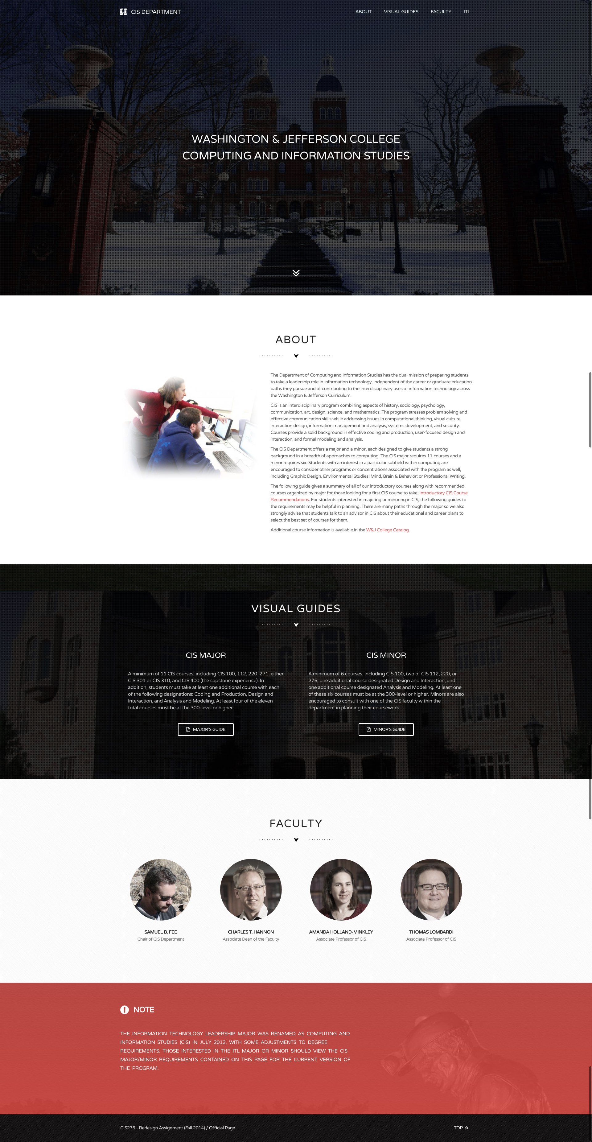
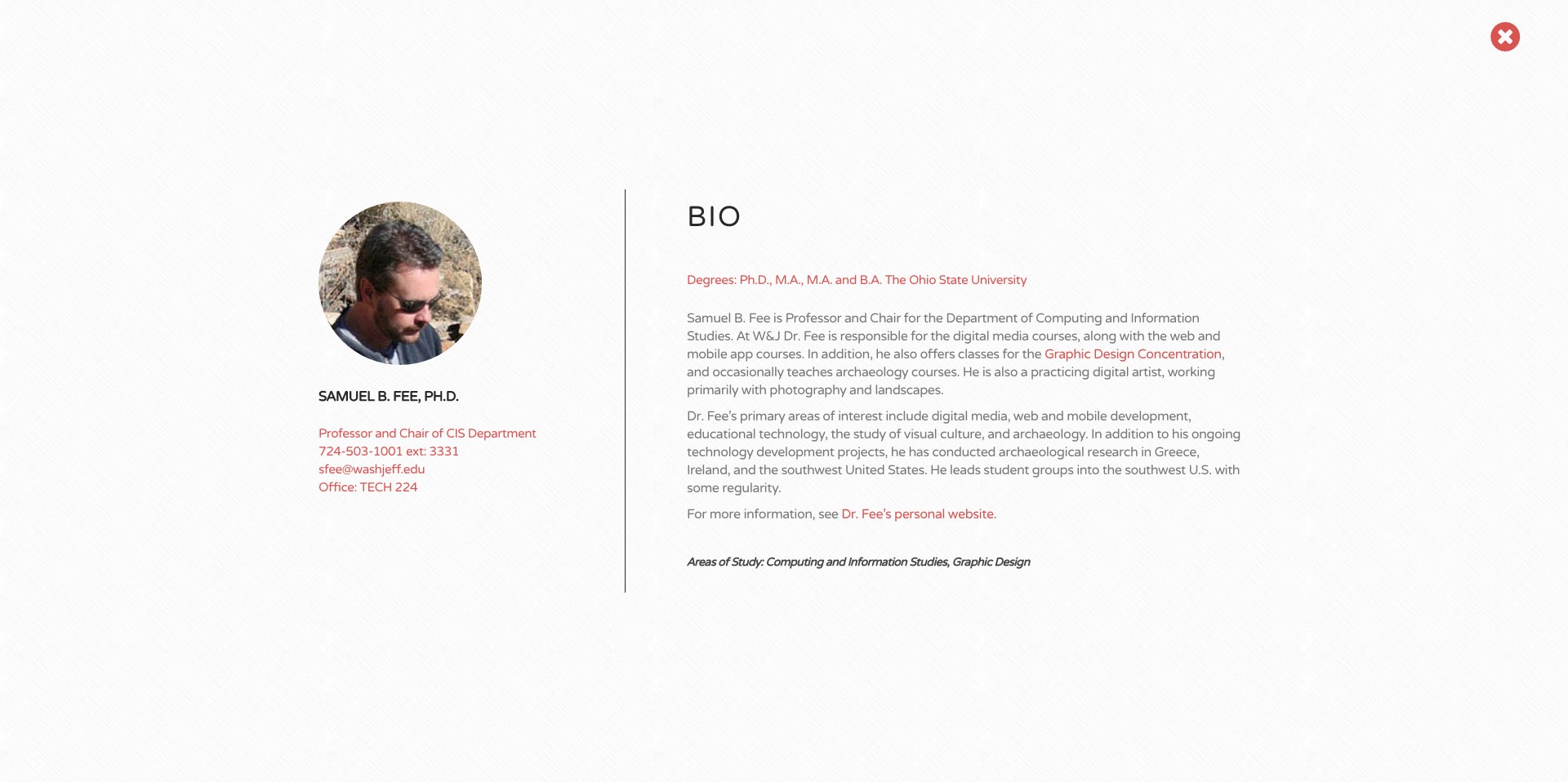
The objective of this project is coding a new page for CIS department while redesigning the current design available in college’s page. In order to accomplish that some steps will be required as a planning document and HTML5 skills. The planning document has the purpose of describe all ideas visually to create a sense of how the page will look on different devices like desktop, tablet and phones. It’s also useful to organize the content along the page checking the best ways of presenting it to the target audience. This process includes some thinking about navigation, ordination of elements, number of pages to be developed, etc. HTML5 (HTML/CSS/Javascript) will be used to accomplish that as well as some additional tools as described below. The planning document has some sketches I made while thinking on page’s design and behavior’s description of certain elements. It also has some notes regarding content to be included as discussed in class. I used Bootstrap again to grid elements appropriately and make the page fully responsive like I have done in the previous assignment. An understanding of media queries was also necessary to make some tweaks for specific screen resolutions. Furthermore, I used jQuery 1.1 JavaScript library as well as a custom script written by me to improve content presentation and interaction. Most of scripts and CSS files are being loaded from CDNs, content delivery networks. The font ‘Varela Round’ is being loaded from Google Fonts API though and its inclusion can be seen at the top of the custom CSS file. I made a multi-page design for this project. The grid layout of the main page is composed by seven elements: fixed navigation menu, introduction, about, visual guides, faculty, ITL and footer. The layout is fluid which means that the composition changes according to device’s dimensions and orientation. Also, the layout is clean and follows college’s official colors - red, black and white - as well as all CRAP principles we have seen in class – contrast, repetition, alignment and proximity. All the layout is based in four scales of colors: red, black, light gray, and white to create contrast and repetition. Dark overlays, gradients and opacity are also being used to increase contrast between elements within the page. Regarding alignment, I used left alignment for large devices and center alignment for mobile ones. However, it’s important to point out that left alignment was left apart in some cases to keep symmetry. For instance, in the visual guides section the symmetry is created by changing between right and left alignment. See in the next paragraph a description of each section. The fixed navigation menu holds links to all sections allowing a quick moving across the page and it’s collapsible on mobile devices, which is essential in terms of usability. The introduction section was created with the purpose of holding user’s attention when entering the website and it’s more about aesthetic than content itself. The about section has the goal of introducing the user to the CIS department and its curriculum. This section also describes the department in details and provides a good sense of what the student can expect of the program. The visual guides section advices students on choosing between major and minor in CIS and has hyperlinks to two pdf files, visual guide to CIS major and visual guide to CIS minor. The faculty section introduces the department’s teaching staff. Each professor has a profile picture and his title below his name. More information is available if you click on their pictures. The ITL section shows a note about major’s renaming. The footer only has a navigation link in the right side that moves the user back to the top if pressed. This element was inserted to improve usability. The page design is hugely influenced by the target audience, which is largely composed by students, employers, alumni, faculty and parents. This also influenced the way the content it’s structured and presented. The page was designed to look clean and simple with an easy navigation flow since different types of people will access the page. This is also one of the reasons why I did not use many pseudo-elements and properties not supported on older browsers. I validated both HTML and CSS files using the W3C online validator and both of them are valid. However, the CSS file has some warnings regarding new properties that were not implemented by W3C yet.