


Lightweight, Material Design inspired button for scroll-to-top of the page. No dependencies. Pure Angular!
✓ Angular 18, Angular Universal (SSR) a Standalone Components compatible
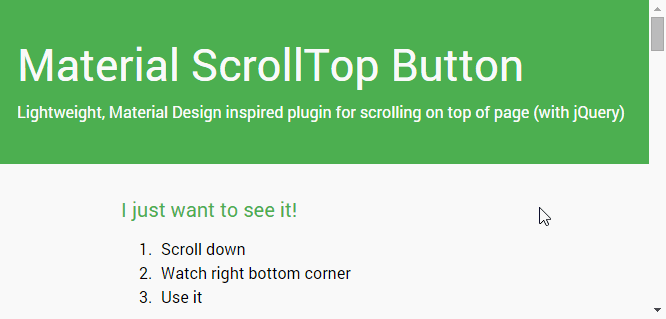
Just hit the button to smoothly scroll back to the top of the page. Here's the demo.
- Lightweight (~2 kB gzipped)
- Angular 18 compatible
- Standalone Components compatible
- Signals compatible
- No dependencies! (only smooth scroll-behavior polyfill for iOS)
- Material Design inspired
@angular/materialcompatible (example)- Component or directive way
- Smoothly animated
- a11y ready
- Highly customizable options...
- Angular 5+ compatible
Watch this demo page
Or play with it live on stackblitz.com/edit/ngx-scrolltop
You're not using the latest version of Angular? See our Angular compatibility instructions…
Via npm or yarn
npm install ngx-scrolltop --save # for lastest Angular only! See our compatibility table

# yarn add ngx-scrolltop| Angular version | ngx-scrolltop | Install |
|---|---|---|
| ng18 | v18.x.x | npm install ngx-scrolltop@latest |
| ng17 | v17.x.x | npm install ngx-scrolltop@17 |
| ng16 | v6.x.x | ng add ngx-scrolltop@6 |
| ng15 | v6.x.x | ng add ngx-scrolltop@6 |
| ng14 | v4.x.x | ng add ngx-scrolltop@4 |
| ng13 | v4.x.x | ng add ngx-scrolltop@4 |
| ng12 | v4.x.x | ng add ngx-scrolltop@4 |
| ng5 – ng11 | v2.x.x | ng add ngx-scrolltop@2 |
You have some options how to use this library. As a component or as a directive.
You can also use it as a Standalone component (new angular way) or as a module (the original angular way).
In your root standalone component (e.g. app.component.ts) you need to add NgxScrollTopComponent into your imports array.
...
+ import { NgxScrollTopComponet } from 'ngx-scrolltop';
...

@Component({
  selector: 'app',
  standalone: true,
  templateUrl: './app.component.html',
  styleUrls: ['./app.component.scss'],
  imports: [
+   NgxScrollTopComponent
  ],
})
export class AppComponent { }
And then in app.component.html you just need to add your new button. Usually at the end of your file.
<ngx-scrolltop></ngx-scrolltop>See options and examples for more details...
In your root standalone component (e.g. app.component.ts) you need to add NgxScrollTopDirective into your imports array.
...
+ import { NgxScrollTopDirective } from 'ngx-scrolltop';
...

@Component({
  selector: 'app',
  standalone: true,
  templateUrl: './app.component.html',
  styleUrls: ['./app.component.scss'],
  imports: [
+   NgxScrollTopDirective
  ],
})
export class AppComponent { }
And then in app.component.html you just need to create your new custom element... (e.g. <span>, <div>, <button>, ...)
<span ngxScrollTop class="my-custom-element-with-my-style__no-lib-style-applied-here">
  ↑ My Custom Element. ↑
</span>
Important note: No style applied, everything is up to you. Of course I recommend position: fixed, ...
See more in examples
This is the original Angular way how to import libraries (via modules). You can use it as a component or as a directive as well.
In your root module (e.g. app.module.ts) you need to add NgxScrollTopModule into your imports array.
...
+ import { NgxScrollTopModule } from 'ngx-scrolltop';
...

@NgModule({
  imports: [
    ...
+   NgxScrollTopModule
  ],
  ...
  bootstrap: [AppComponent]
})
export class AppModule { }
Next steps you can see above in Standalone Component or Standalone Directive or in examples.
| Option | Type | Default | Description |
|---|---|---|---|
| mode | 'smart' | 'classic' |
'classic' |
Smart mode shows button only when you scroll more than two screens down and then you will try to go back to top. Classic mode shows button immediately when you scroll at least one screen down. |
| backgroundColor | string | #212121 | Background color (you can use all values for backgroud-color css property). You can override theme color |
| symbolColor | string | #fafafa | Symbol color (you can use all values for fill svg property). You can override theme color |
| size | number | 40 | Button size [in pixels]. (Symbol will be resized automatically) |
↑ |
|||
| position | 'left' | 'right' |
'right' |
Left or right, that is the question... |
| theme | NgxScrollTopTheme | 'gray' |
Choose from official Material color themes |
You can use content projection for your own symbol.
<ngx-scrolltop> ↑ </ngx-scrolltop>Or you can even use your own components or fonts (e.g. fontAwesome)
<ngx-scrolltop>
  <i class="fa fa-arrow-up"></i>
</ngx-scrolltop>| Option | Type | Default | Description |
|---|---|---|---|
| [ngxScrollTopMode] | 'smart' | 'classic' |
'classic' |
Smart mode shows button only when you scroll more than two screens down and then you will try to go back to top.Classic mode shows button immediately when you scroll at least one screen down. |
app.component.html
<ngx-scrolltop
  [size]="50"
  backgroundColor="#33691e"
  symbolColor="#fff"
  mode="smart"
  position="left"
  theme="pink"
>
  ↑
</ngx-scrolltop>@angular/material required
app.component.html
<button
  ngxScrollTop
  [ngxScrollTopMode]="'smart'"
  class="my-custom-style"
  color="primary"
  mat-mini-fab
>
  top
</button>
app.component.scss
.my-custom-style {
  position: fixed;
  right: 20px;
  bottom: 20px;
}Pure Angular! (with smooth scroll-behaviour polyfill for iOS)
If you are using older Angular (5 – 11) you will see this error on build or start:
ERROR in node_modules/ngx-scrolltop/lib/ngx-scrolltop.core.service.d.ts:13:21 - error TS2694: Namespace '"/Users/user/projects/my-project/node_modules/@angular/core/core"' has no exported member 'ɵɵFactoryDeclaration'.
Easy! Use compatibility version of this library npm install ngx-scrolltop@2 --save
See our Angular compatibility instructions…
If you are using Angular 14 with latest ngx-scrolltop library, you will see this error on build or start:
Error: node_modules/ngx-scrolltop/lib/ngx-scrolltop.component.d.ts:21:18 - error TS2707: Generic type 'ɵɵComponentDeclaration' requires between 7 and 8 type arguments.

21     static ɵcmp: i0.ɵɵComponentDeclaration<NgxScrollTopComponent, "ngx-scrolltop", never, { "backgroundColor": "backgroundColor"; "symbolColor": "symbolColor"; "size": "size"; "symbol": "symbol"; "position": "position"; "theme": "theme"; "mode": "mode"; }, {}, never, ["*"], false, never>;
                    ~~~~~~~~~~~~~~~~~~~~~~~~~~~~~~~~~~~~~~~~~~~~~~~~~~~~~~~~~~~~~~~~~~~~~~~~~~~~~~~~~~~~~~~~~~~~~~~~~~~~~~~~~~~~~~~~~~~~~~~~~~~~~~~~~~~~~~~~~~~~~~~~~~~~~~~~~~~~~~~~~~~~~~~~~~~~~~~~~~~~~~~~~~~~~~~~~~~~~~~~~~~~~~~~~~~~~~~~~~~~~~~~~~~~~~~~~~~~~~~~~~~~~~~~~~~~~~~~~~~~~~~~~~~~~~~


Error: node_modules/ngx-scrolltop/lib/ngx-scrolltop.directive.d.ts:17:18 - error TS2707: Generic type 'ɵɵDirectiveDeclaration' requires between 6 and 8 type arguments.

17 static ɵdir: i0.ɵɵDirectiveDeclaration<NgxScrollTopDirective, "[ngxScrollTop]", never, { "mode": "ngxScrollTopMode"; }, {}, never, never, false, never>;Easy! Use compatibility version of this library npm install ngx-scrolltop@4 --save
See our Angular compatibility instructions…
Give a ⭐️ if this project helped you!
Or if you are brave enough consider making a donation for some 🍺 or 🍵 ;)
Copyright © 2023 Lukas Bartak
Proudly powered by nature 🗻, wind 💨, tea 🍵 and beer 🍺 ;)
All contents are licensed under the MIT license.