App Icon #2396
Replies: 18 comments 22 replies
-
|
I've been iterating on this a little more and playing around with something more skeuomorphic that better represents an actual terminal: a keyboard. Same idea with the colours and theme but it feels a little more tangible. Would love some feedback! ⌘ + TabIcon
|

Beta Was this translation helpful? Give feedback.
-
|
I've tweaked the perspective (and material) a tiny bit to give it more depth.
|

Beta Was this translation helpful? Give feedback.
-
|
Thanks for this! I do like how this looks, but I am a dark mode vampire and I find the amount of "white" to be too bright for my eyes. Could you also make a dark mode variant? I like the purple tones. I'd love it if the Operator Mono |
Beta Was this translation helpful? Give feedback.
-
|
@wez thanks for the feedback! here's a dark mode iteration, i think it looks even better:
and i'll try a version with operator mono as well |


Beta Was this translation helpful? Give feedback.
-
|
Spent a little more time refining the dark mode key concept. @wez I tried using Operator Mono as suggested however the SVG from the current icon was too thin—and when I looked into the licensing of Operator Mono it seems that this use case is not covered. I've made the board inset and I've tweaked the lighting and keycap materials to give it a more polished/shiny effect. ⌘ TabCamera 1
Camera 2
|


Beta Was this translation helpful? Give feedback.
-
|
Still more tweaking, trying to bring back the colourful playfulness of the light-mode icon: ⌘ TabIcon
|

Beta Was this translation helpful? Give feedback.
-
|
A little more colourful:
|

Beta Was this translation helpful? Give feedback.
-
|
Even more colourful:
|

Beta Was this translation helpful? Give feedback.
-
|
I know this an old thread, but did you end up making an .icns for this? I'd love to use it. |
Beta Was this translation helpful? Give feedback.
-
|
Love this! Using it rn. @kyle-kettler, you can just download the png file linked above. You might want to use some sketchy online website to convert it to an icns file. |
Beta Was this translation helpful? Give feedback.
-
|
I think it's best if you keep it simple and 2D ideally, to make it cross platform. |
Beta Was this translation helpful? Give feedback.
-
|
Could you make an repository like kitty-icon? |
Beta Was this translation helpful? Give feedback.
-
|
Thank you for this effort! The existing icon is barely visible on Windows, Compare that to other icons. I would prefer a simpler icon that would look good even when very small. I don't want the taskbar to steal too much space from other windows. In fact, changing the background to a light color in the existing icon would make it much easier to discern. Also, maybe we could remove "$" and just leave a stylish "W"? |

Beta Was this translation helpful? Give feedback.
-
|
Some general feedback: I'd prefer and recommend a 2D icon: FWIW, 2D icons are the current standard, and having an icon that doesn't fit the overall look isn't so nice. A subtle shade in the background would be fine of course. Regarding the colors, I'd recommend some simplicity. I like the way Apple approaches this: If you look at their icons, for example, you'll notice that most of the time, the background or the foreground consists of a single color. Sometimes they'll use a gradient or rainbow in the foreground, but keep the background in a single color (cf. "Photos" app). This makes the detail come out better. As for the rounded square shape: 👍 |
Beta Was this translation helpful? Give feedback.
-
|
current icon is the best, please don't change it, i love that purple color on black and simple $W text, don't make it look like teenage app! |
Beta Was this translation helpful? Give feedback.
-
|
Purple on black doesn't have enough contrast to be easily visible. Icons with poor contrast "stand out" as dirty blobs in the middle of the well designed icons. I agree that it's best to keep the icon simple and 2D. Extra borders and other 3D stuff is hard to see if small icons are used. |
Beta Was this translation helpful? Give feedback.
-
|
@gf3 I love your icons. Ignore the haters like they should ignore your icons, if they don't like or need them. Having alternatives to the current icon is much needed as the current one has some UI/UX issues. Did you bundle them in a repo? |
Beta Was this translation helpful? Give feedback.
-
|
@rafo thank you! i haven't bundled it anywhere as interest seemed to drop off |
Beta Was this translation helpful? Give feedback.
-
|
Nice icons! For windows the titlebar/taskbar icon sizing can be fairly small. Here is a sample of the icon next to some others along with the ico files. The 3d icon could be cropped slightly more to make it somewhat bigger. |

Beta Was this translation helpful? Give feedback.
-
|
@gf3 I really like your icons - camera 2 for me. I don't like the current WezTerm purple-and-black icon in use, it's really drab. Would you be able to share your lovely icon please? |
Beta Was this translation helpful? Give feedback.
-
|
@robrecord thank you, rob. you should be able to just download the png from the above threads :) |
Beta Was this translation helpful? Give feedback.
-
|
Love your work @gf3. I went in a slightly more conservative direction with mine. Trying to match Terminal.app and iTerm 2 but also give it some WezTerm feeling.
I think, to make it feel as at home as possible, there should be custom icons for each platform. Maybe Windows and Unix can share, not too familiar, but macOS at least has a very distinct style that's unlike Windows'. |

Beta Was this translation helpful? Give feedback.
-
|
This one fits best in the overall macOS Icon look, in my view <3 |
Beta Was this translation helpful? Give feedback.
-
|
two small suggestions:
|
Beta Was this translation helpful? Give feedback.
-
|
Here you go: bigger and a bit more bright https://macosicons.com/#/u/mikker (not approved yet) |
Beta Was this translation helpful? Give feedback.
-
|
|

Beta Was this translation helpful? Give feedback.
-
|
thank you <3 |
Beta Was this translation helpful? Give feedback.
-
|
Next to the others. @wez are you open to pull requests? Would you like the decide or do you want to do something like a vote? What could be the next steps? |

Beta Was this translation helpful? Give feedback.
-
|
My stance is:
|
Beta Was this translation helpful? Give feedback.
-
|
Very reasonable. Can you point me to the part of the setup that handles bundling the apps with icons? Not too familiar with Rust nor Cargo or the distribution process but willing to put some time into making what you described here happen. |
Beta Was this translation helpful? Give feedback.
-
|
It's kind of involved, but you can find some of the places by grepping: $ rg assets/icon
README.md
3:<img height="128" alt="WezTerm Icon" src="https://raw.githubusercontent.com/wez/wezterm/main/assets/icon/wezterm-icon.svg" align="left"> *A GPU-accelerated cross-platform terminal emulator and multiplexer written by <a href="https://github.com/wez">@wez</a> and implemented in <a href="https://www.rust-lang.org/">Rust</a>*
wezterm-gui/src/termwindow/mod.rs
92:pub const ICON_DATA: &'static [u8] = include_bytes!("../../../assets/icon/terminal.png");
ci/appimage.sh
12:install -Dm644 assets/icon/terminal.png AppDir/usr/share/icons/hicolor/128x128/apps/org.wezfurlong.wezterm.png
ci/deploy.sh
170:install -Dm644 assets/icon/terminal.png %{buildroot}/usr/share/icons/hicolor/128x128/apps/org.wezfurlong.wezterm.png
244: install -Dm644 assets/icon/terminal.png pkg/debian/usr/share/icons/hicolor/128x128/apps/org.wezfurlong.wezterm.png
293: assets/icon/terminal.png
294: assets/icon/wezterm-icon.svg
ci/build-docs.sh
56:cp "assets/icon/terminal.png" docs/favicon.png
57:cp "assets/icon/wezterm-icon.svg" docs/favicon.svg
ci/generate-workflows.py
12: "assets/icon/*",
assets/icon/update.sh
5:cd $(git rev-parse --show-toplevel)/assets/icon
assets/flatpak/org.wezfurlong.wezterm.template.json
34: "install -Dm644 ./assets/icon/terminal.png /app/share/icons/hicolor/128x128/apps/org.wezfurlong.wezterm.png",
assets/flatpak/org.wezfurlong.wezterm.json
38: "cp ./assets/icon/terminal.png /app/share/icons/hicolor/128x128/apps/org.wezfurlong.wezterm.png",On X11/Wayland: the icon shown in menus is specified via the Most of the packaging logic is found in |
Beta Was this translation helpful? Give feedback.
-
|
None of these look close to being dynamically reconfigurable once the thing is built? It would have to be a build flag with a path to a png or something. All three platforms probably have ways to update icons "live". I'll have to investigate. (Fwiw I'm currently doing this after recompiling WezTerm |
Beta Was this translation helpful? Give feedback.
-
|
Yeah, these are baked in at compile time. I'm actively opposed to adding build-time configuration options/feature flags for icons, but I'm open to adjusting the core logic to allow for more runtime flexibility where it makes sense. I'm not sure what can be done in-app on macOS without rewriting the application plist and potentially invalidating the code signing. On X11/Wayland, the icon is largely none of wezterm's business, except for the ICON_DATA compiled in resource used on X11. That could turned into a configuration option that specifies a user-provided path or falls back to a compile time option. On Windows: the icon shown in Explorer comes from the one encoded in the manifest which is a compile time option. Similar to macOS, changing that after build will potentially invalidate any code signing that we do in the future. The icon shown in the task switcher can probably be overridden at runtime by doing some stuff in the WindowProc, but needs more investigation. |
Beta Was this translation helpful? Give feedback.
-
|
The only real problem for me is the low contrast between the Additionally, dark background is somewhat problematic, especially on MacOS. Some MacOS icons have dark background, but they employ gradients around the edge (Apple TV, Stocks) or have a large image filling most of the icon (Clock, Mission Control). Generally, a bright background is a safer bet, especially if a single cross-platform icon is needed. |
Beta Was this translation helpful? Give feedback.
-
|
On the contrast problem, @mikker's icon has a contrast ratio of 2.88 (fail). This is of course an issue present with the current icon, but we should solve it here too. This will be seen as small text, so we would want a contrast ratio of AA or better. For more detail on WCAG 2.0 contrast guidelines, this is a great, short resource. Without changing the background colour, the colour closest to the current choice that meets this is Here's a mockup:
|

Beta Was this translation helpful? Give feedback.
-
|
Would be cool if the dock icon could be configured (to a built in preset.) Not sure if this is possible. I am finding that the contrast of the current icon is too low and I find it hard to recognise on the dock. |
Beta Was this translation helpful? Give feedback.
-
|
Doesn't sound like it's neither easy to add nor on the roadmap. I do this |
Beta Was this translation helpful? Give feedback.
-
|
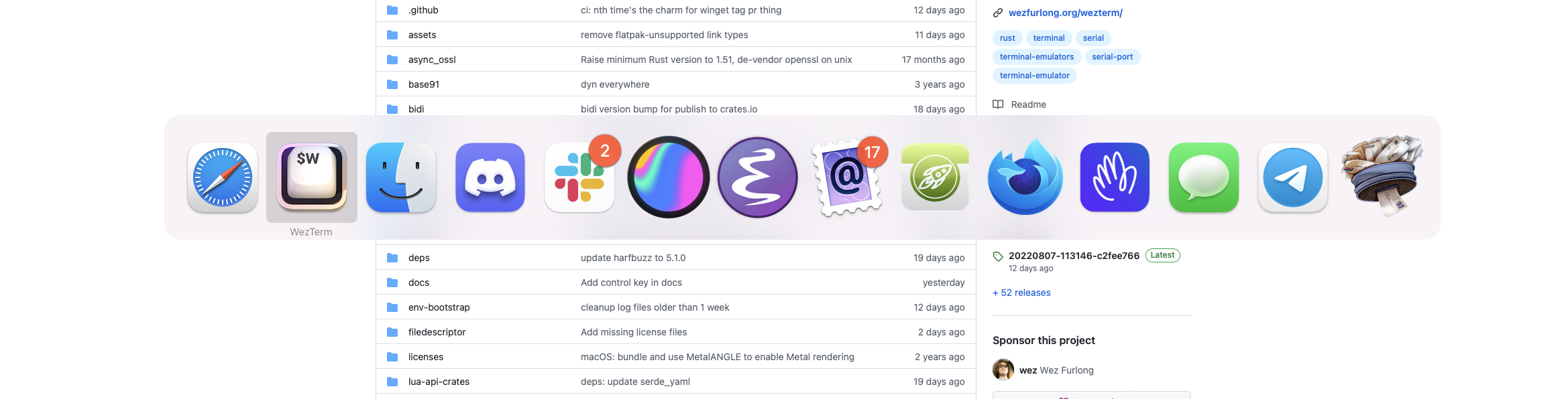
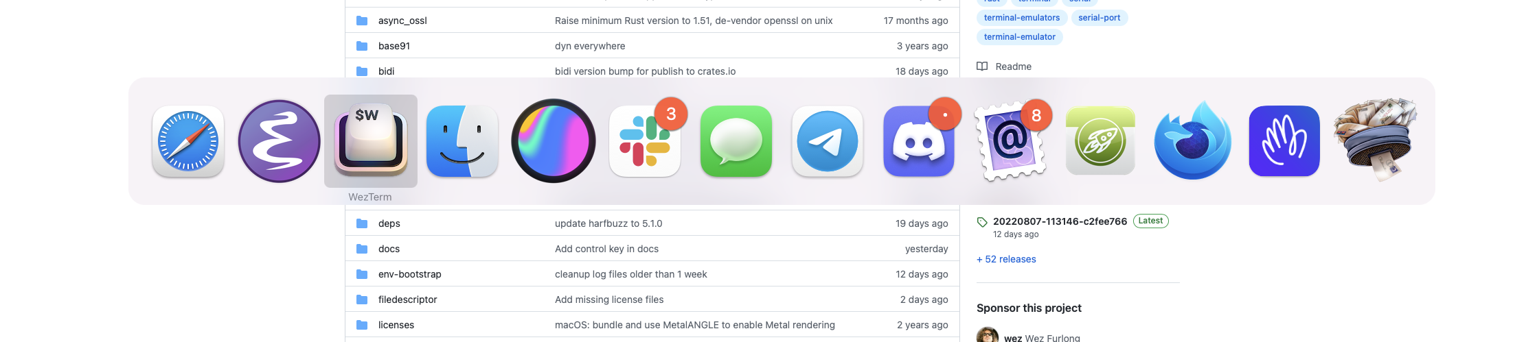
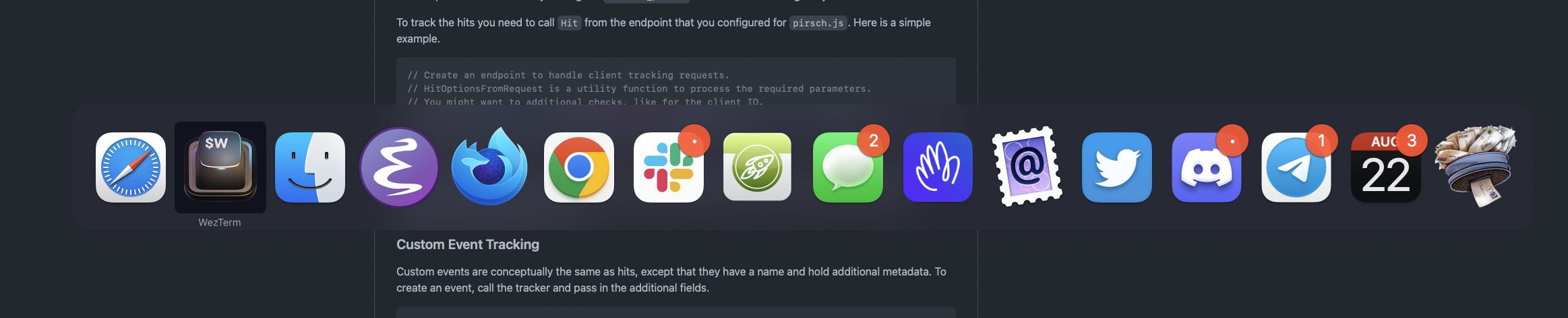
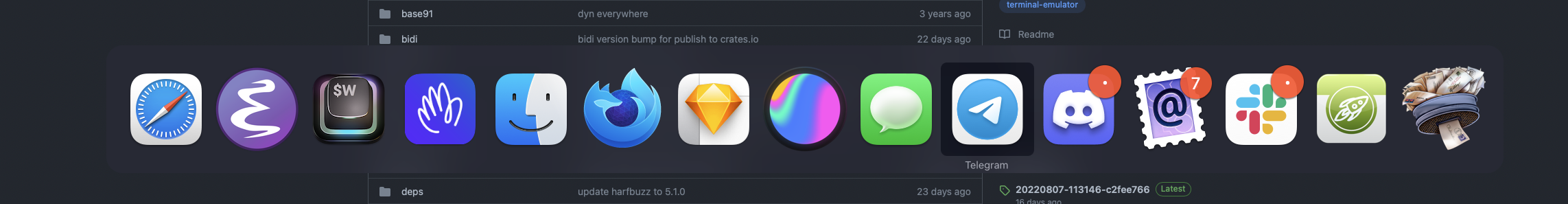
Here's a handy repo if you want to use my logo on macOS: https://github.com/mikker/wezterm-icon |
Beta Was this translation helpful? Give feedback.
-
|
Very Helpful! Here is a script to automate everything on MacOS Create a new folder with "new_wezterm.png" , and this script locally then run it. Then copy output .icns object to #!/bin/bash
#
# Following instructions
# https://gist.github.com/ansarizafar/6fa64f44aa933794c4d6638eec32b9aa
#
# Original image
INPUT_IMAGE="new_wezterm.png"
# Step 1
echo " ==== Creating icons for $INPUT_IMAGE "
sips -s format png --resampleHeightWidth 16 16 "${INPUT_IMAGE}" --out "icon_16x16.png"
sips -s format png --resampleHeightWidth 32 32 "${INPUT_IMAGE}" --out "[email protected]"
sips -s format png --resampleHeightWidth 32 32 "${INPUT_IMAGE}" --out "icon_32x32.png"
sips -s format png --resampleHeightWidth 64 64 "${INPUT_IMAGE}" --out "icon_64x64.png"
sips -s format png --resampleHeightWidth 128 128 "${INPUT_IMAGE}" --out "icon_128x128.png"
sips -s format png --resampleHeightWidth 256 256 "${INPUT_IMAGE}" --out "[email protected]"
sips -s format png --resampleHeightWidth 256 256 "${INPUT_IMAGE}" --out "icon_256x256.png"
sips -s format png --resampleHeightWidth 512 512 "${INPUT_IMAGE}" --out "[email protected]"
sips -s format png --resampleHeightWidth 512 512 "${INPUT_IMAGE}" --out "icon_512x512.png"
sips -s format png --resampleHeightWidth 1024 1024 "${INPUT_IMAGE}" --out "[email protected]"
# Step 2
ICONSET_FOLDER="my_wez_icon.iconset"
echo " ==== Moving images to iconset folder"
mkdir $ICONSET_FOLDER
find . -type f \
-maxdepth 1 \
-name "*.png" \
-not -name "${INPUT_IMAGE}" \
-exec mv {} $ICONSET_FOLDER \;
# Step 3
echo " ==== Converting .iconset folder to icns "
iconutil -c icns $ICONSET_FOLDER
|
Beta Was this translation helpful? Give feedback.
-
I've been using WezTerm for the past few days an absolutely loving it. As such I've started hacking on an icon and I wanted to solicit feedback and gauge interest in a little refresh for the WezTerm app icon.
I would love critical feedback or better yet if anyone is willing to iterate on the icon with me I'd be happy to share the Sketch file.
It's a take on a common terminal icon scheme—but with a colourful twist. I like the idea of something bright and welcoming.
Please let me know what you think!
Without background
Beta Was this translation helpful? Give feedback.
All reactions